The mission
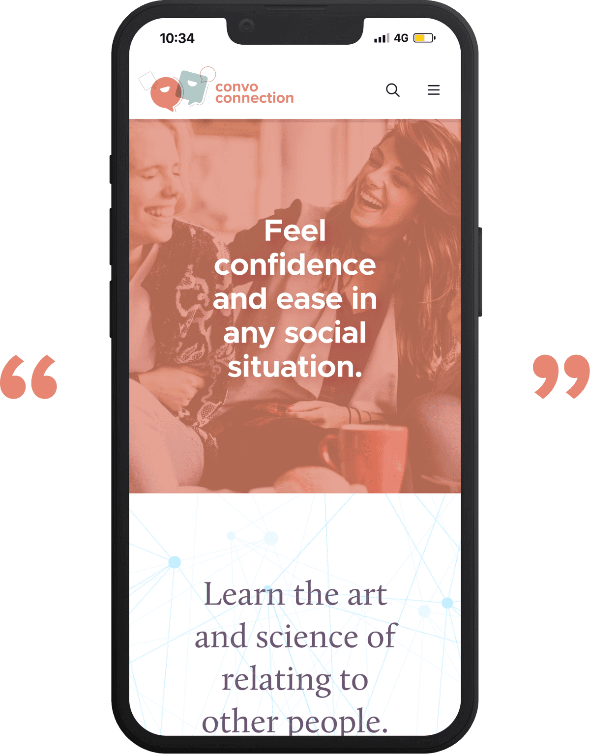
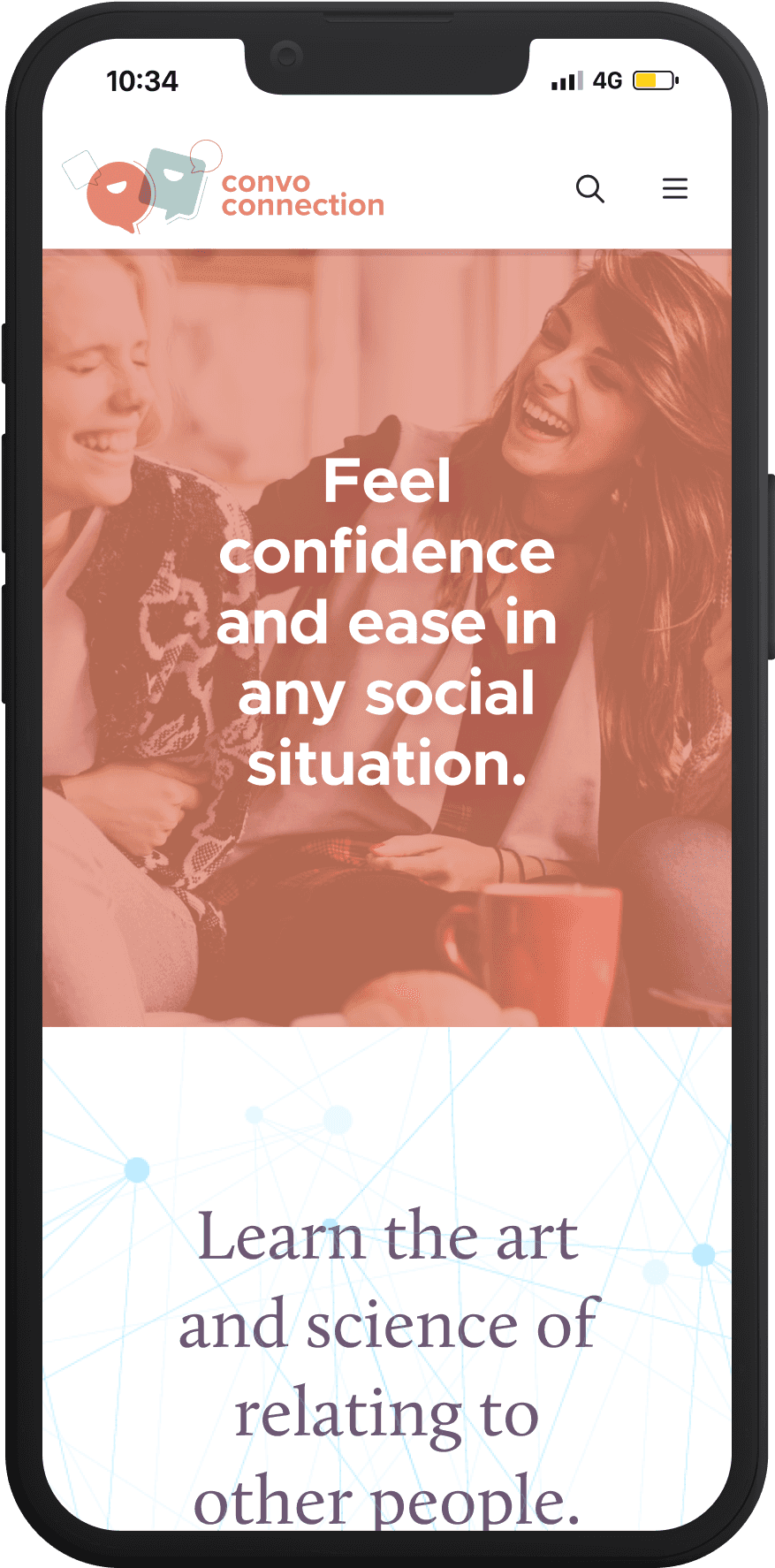
Convo Connection was a resource for those struggling to make genuine personal connections. It offered readers the promise to “Feel confidence and ease in any social situation” and “Learn the art and science of relating to other people."
The tone
Breaking through the barriers of connecting to others is hard enough. We wanted Convo Connection to be easy, relaxed and informative.





Identity
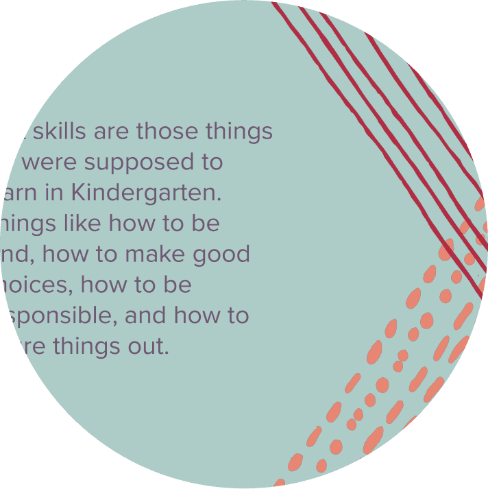
The color palette, photography, and quotes from the website served as inspiration for the logo design. It conveys joy and ease through a relaxing color palette and playful shapes.
Typography
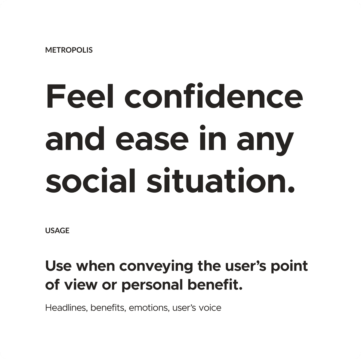
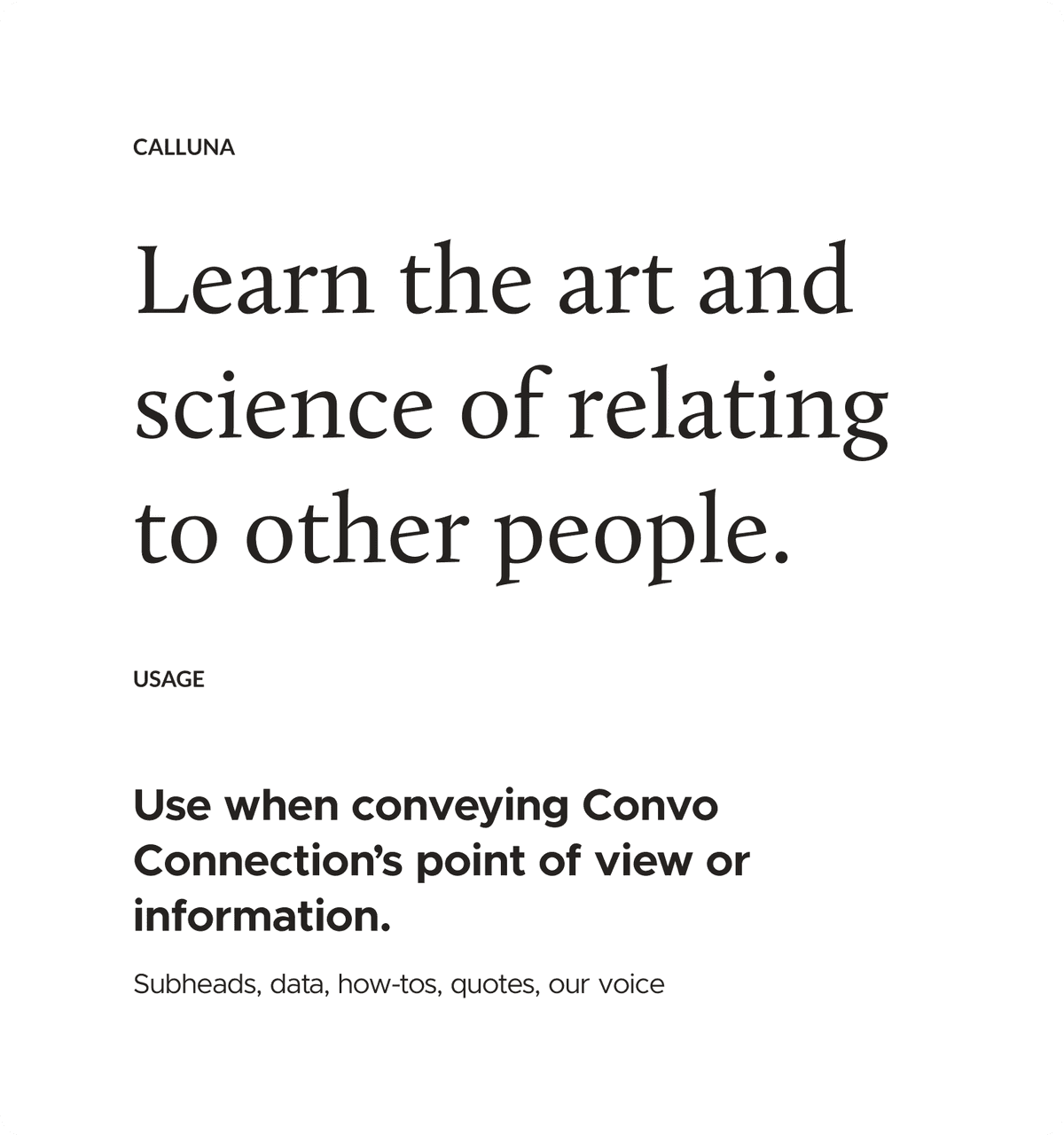
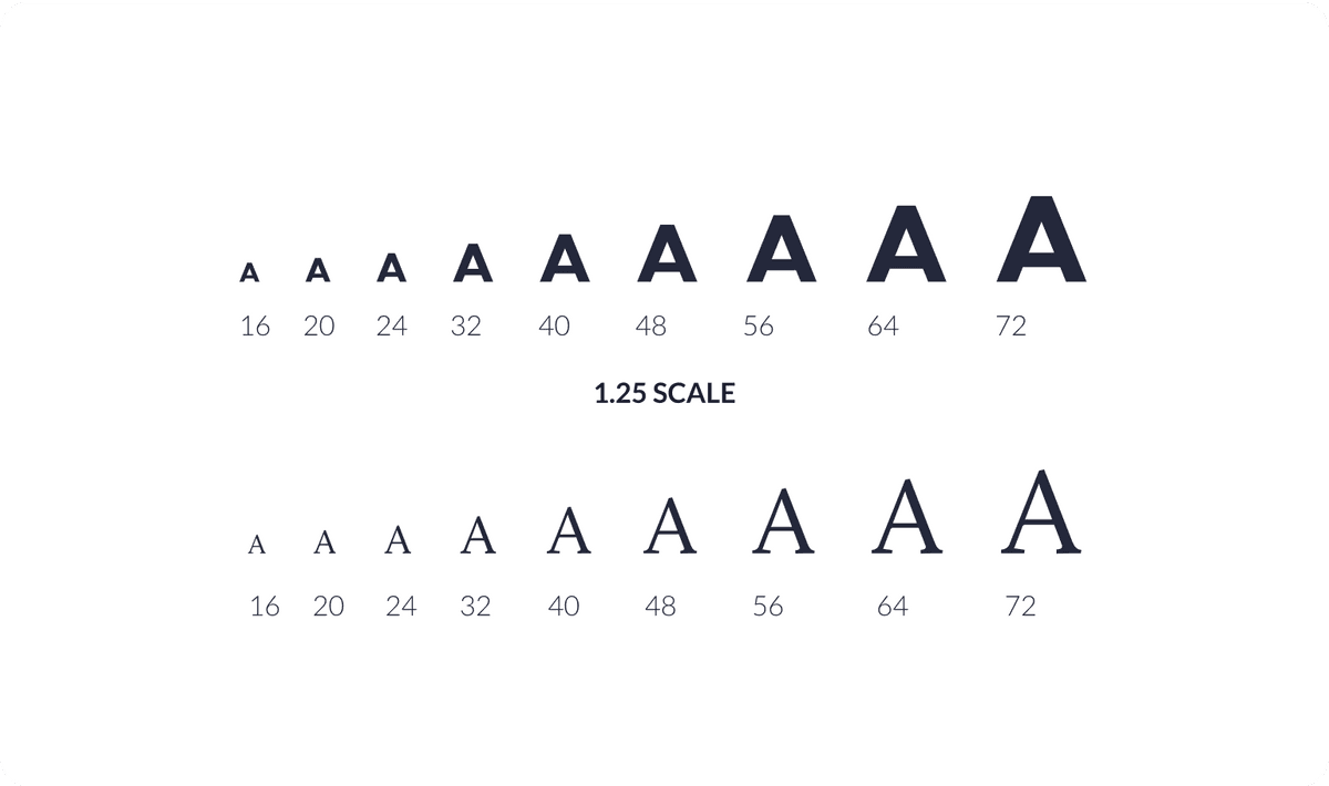
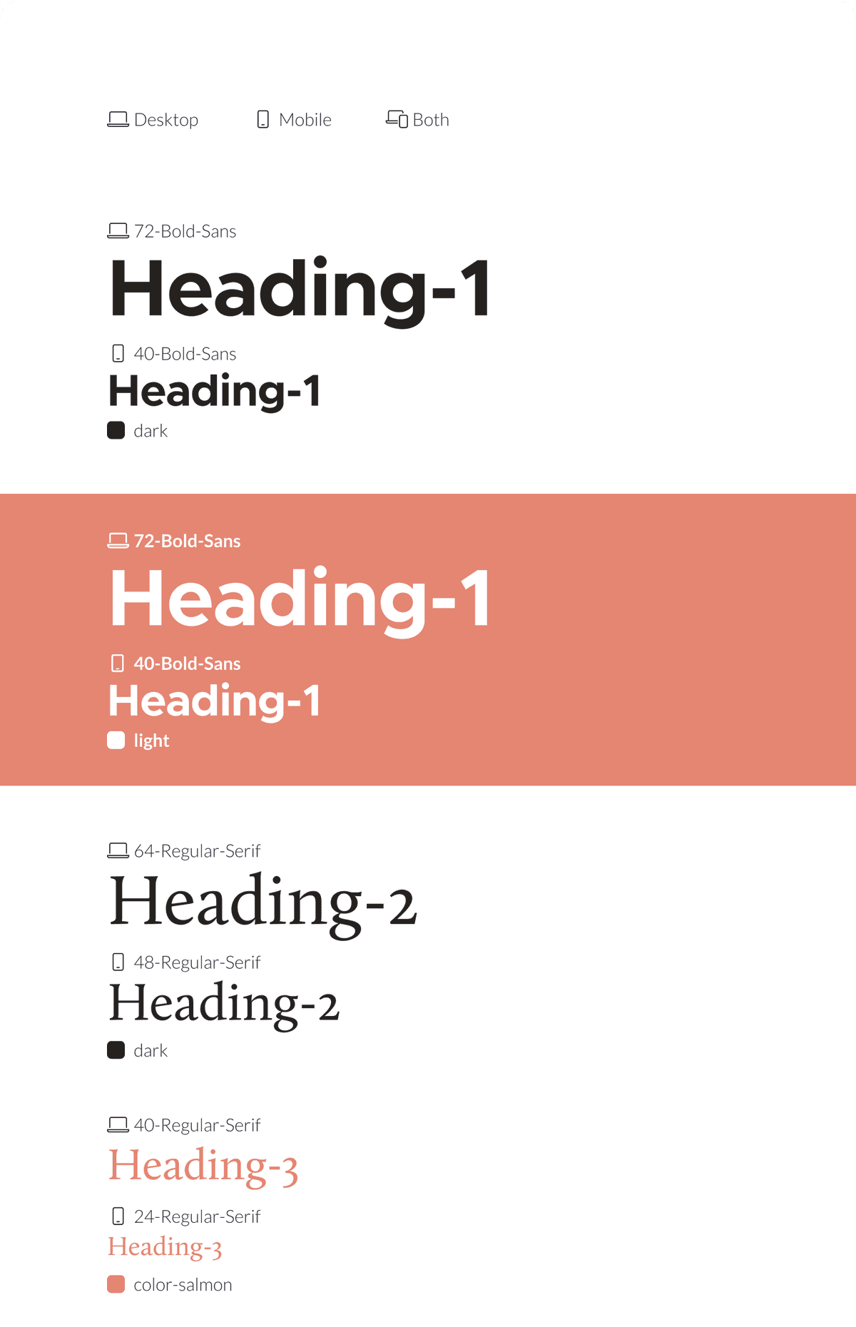
Two fonts and a type scale governed the content hierarchy. Each font represented one side of the conversation—either the reader or us.
The website was only in ‘light mode’ corresponding to the tone of the brand. But light-on-dark styles were available for color blocking and photography.
Fonts
Type Scale
Web Tokens
Color
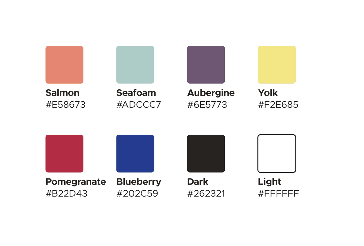
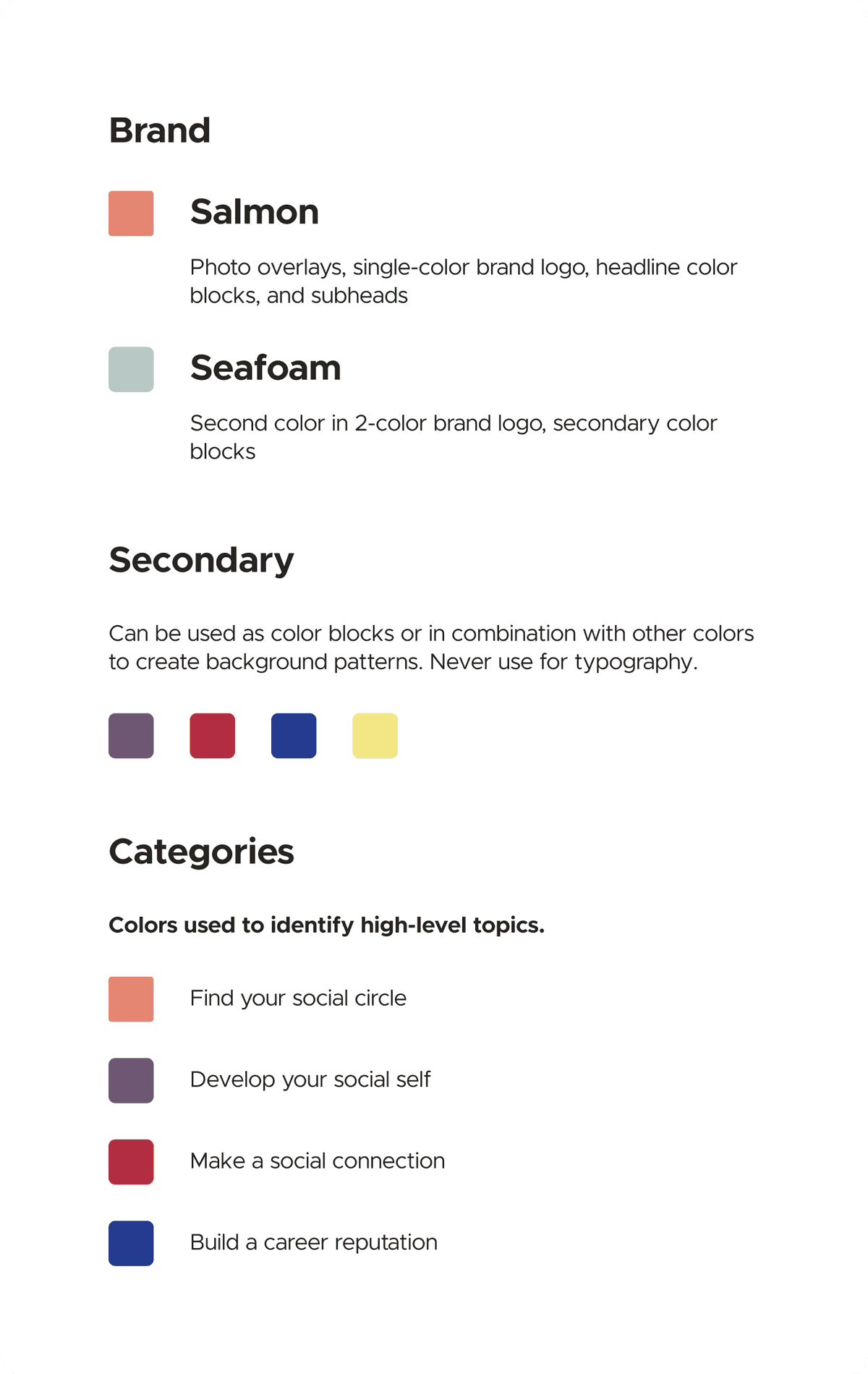
A small set of colors provide just enough variation for articles, downloadable content, and social media posts.
The color palette is a perfect balance of soft and bright supporting the brand’s tone of joy and ease.
Website
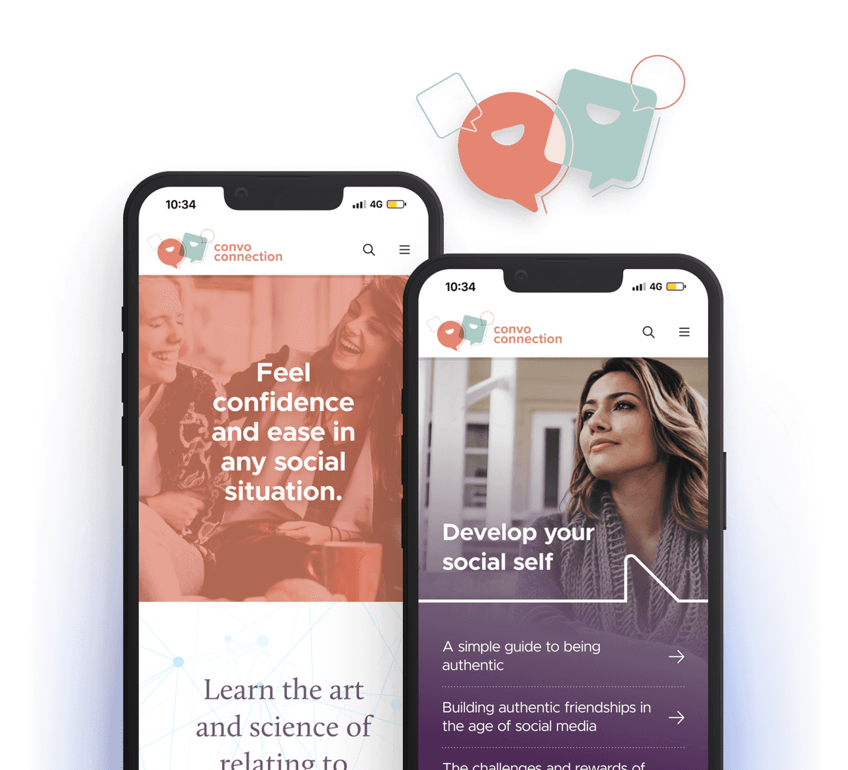
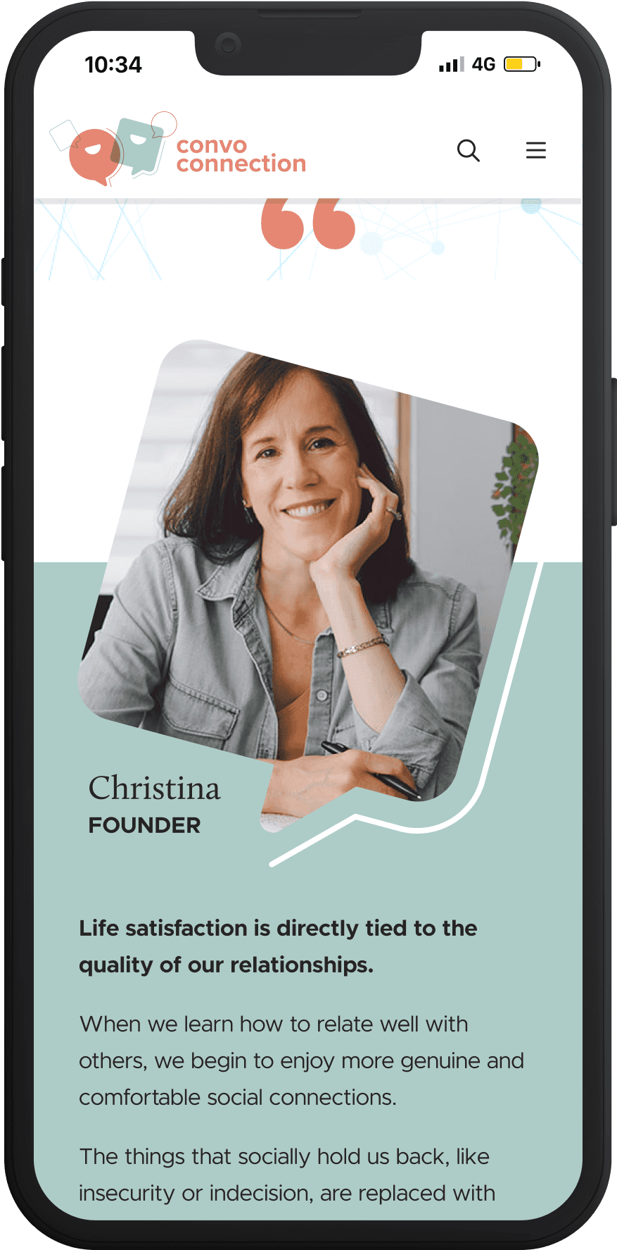
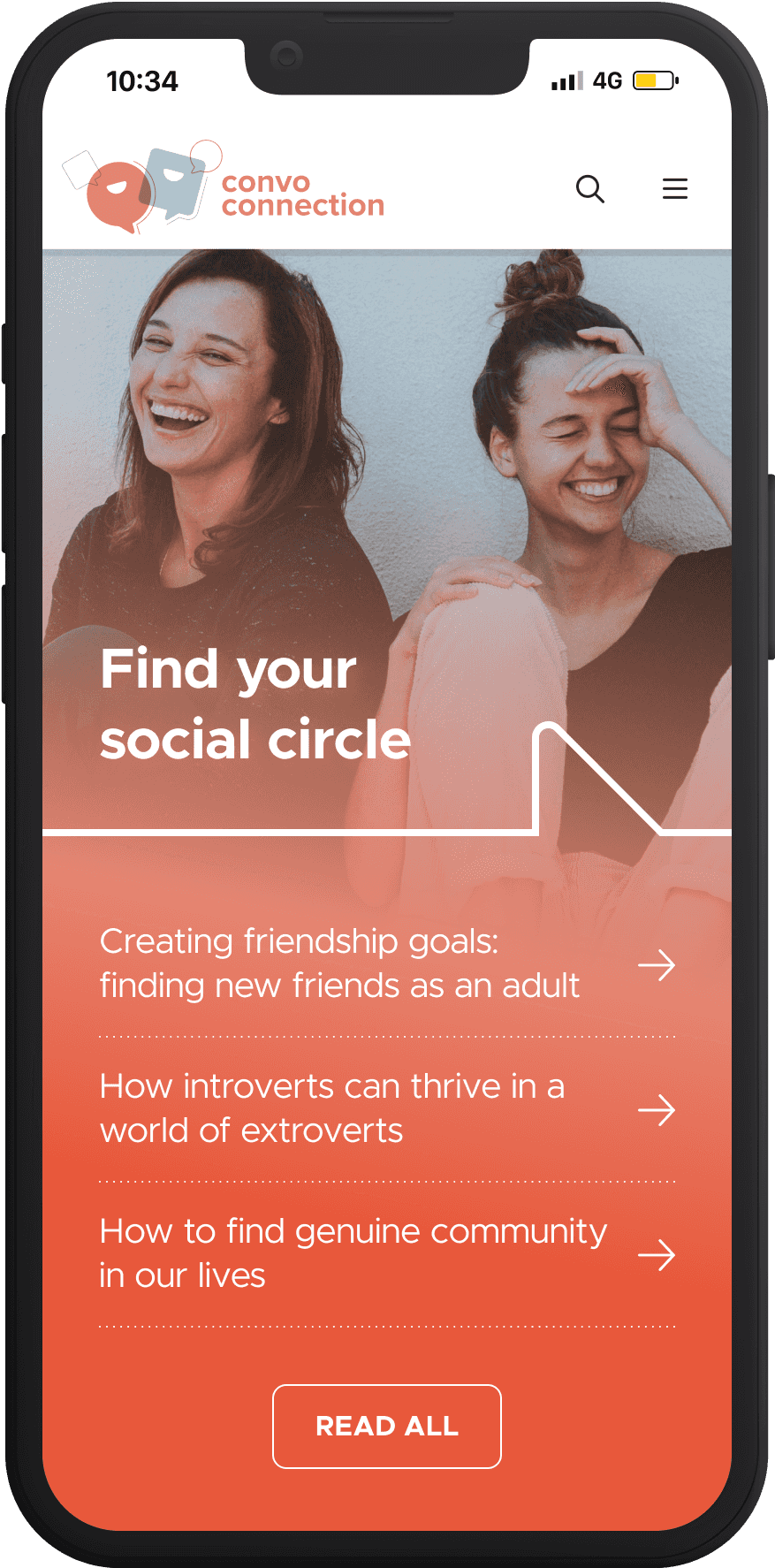
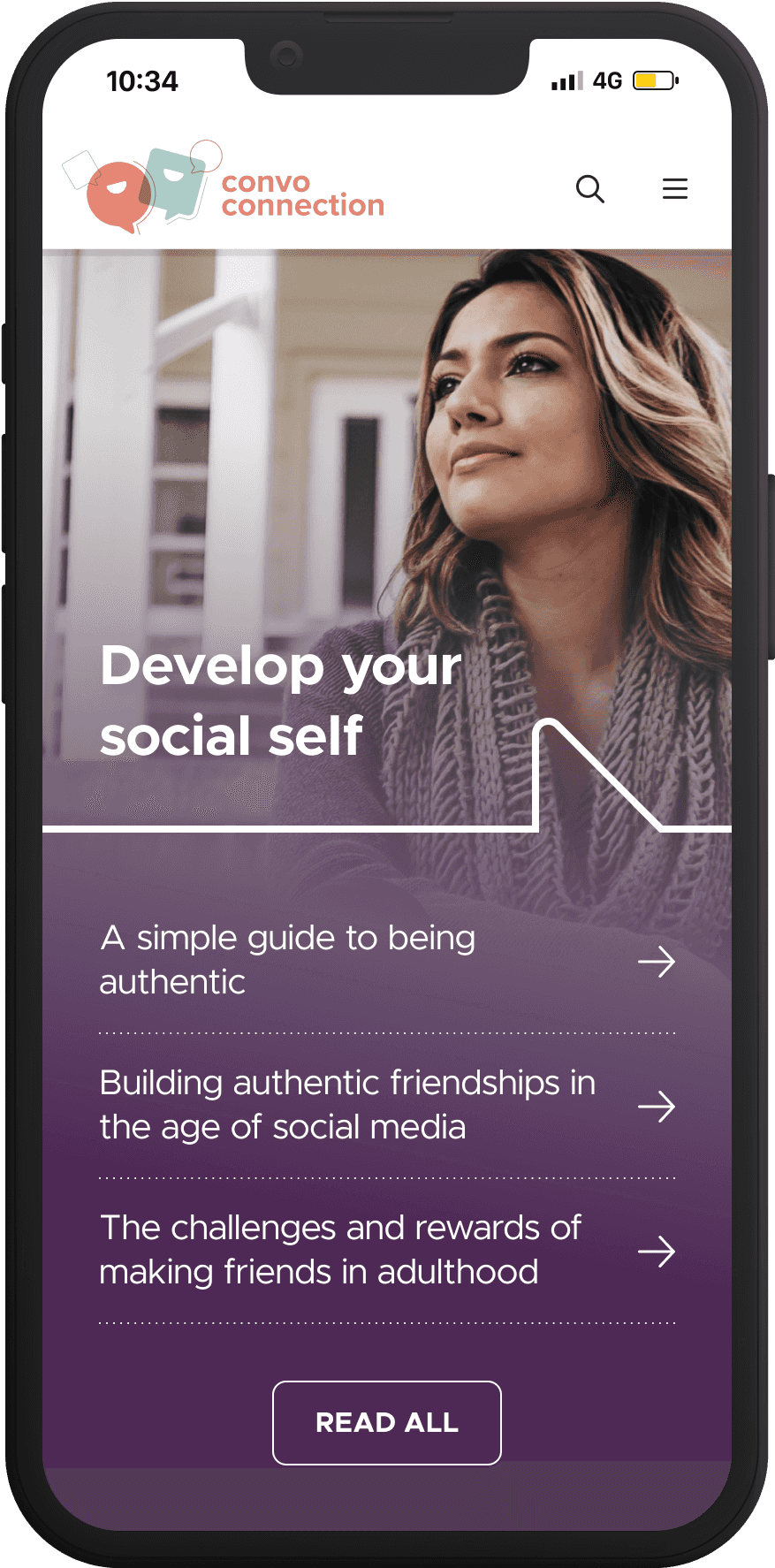
A mobile-first website leveraged responsive and adaptive design so that readers could dive into new content wherever they are.
Categories
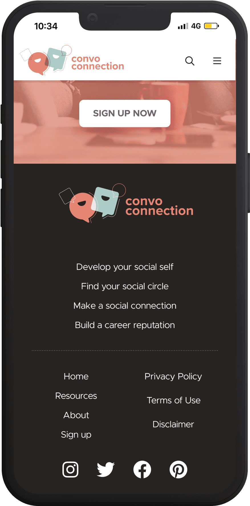
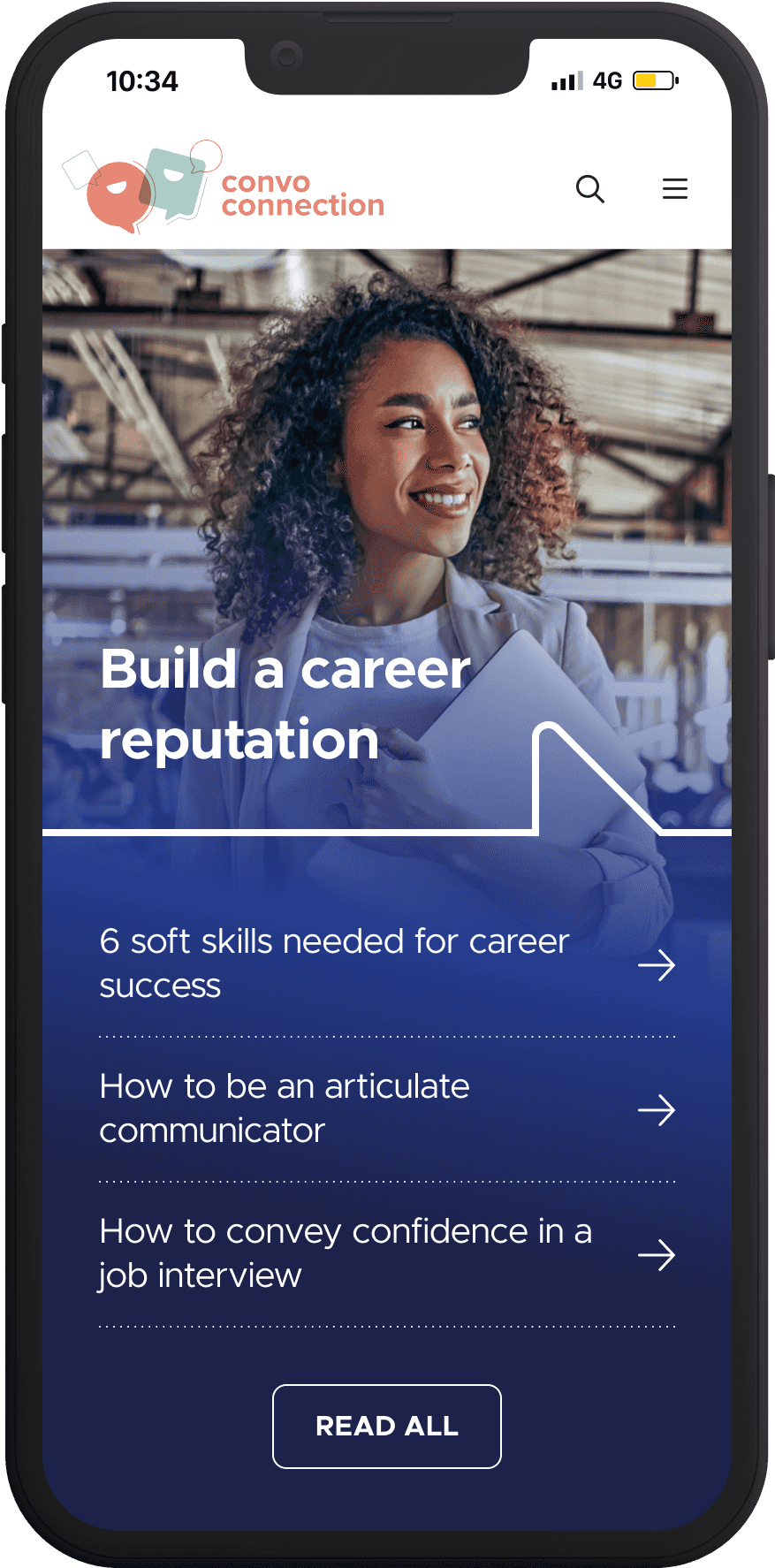
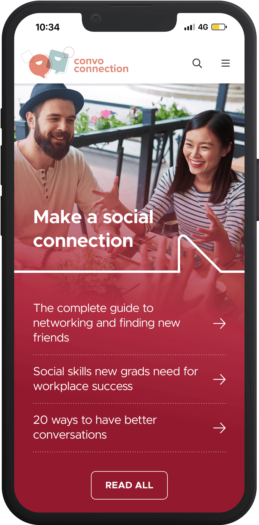
All posts fell into one of four categories focused around reader goals. The homepage surfaced relevant posts in each category for faster navigation.
Dowloadable Content
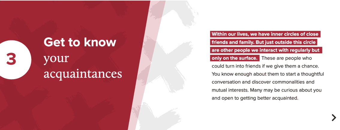
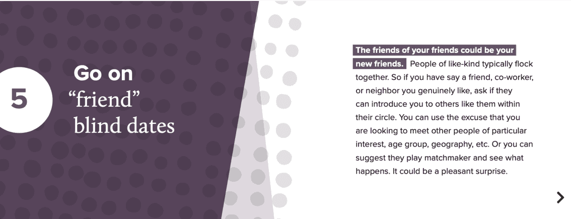
Free downloadables gave readers tools and resources for improving their social connections. The tone of the brand carried through all documents, whether simple checklists or complex multi-page documents.
Tech stack
All documents were designed in InDesign and Acrobat.





Social
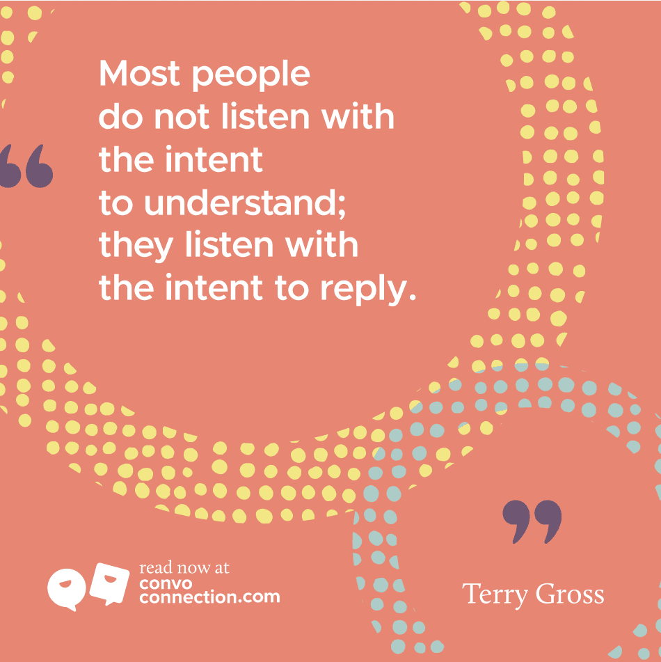
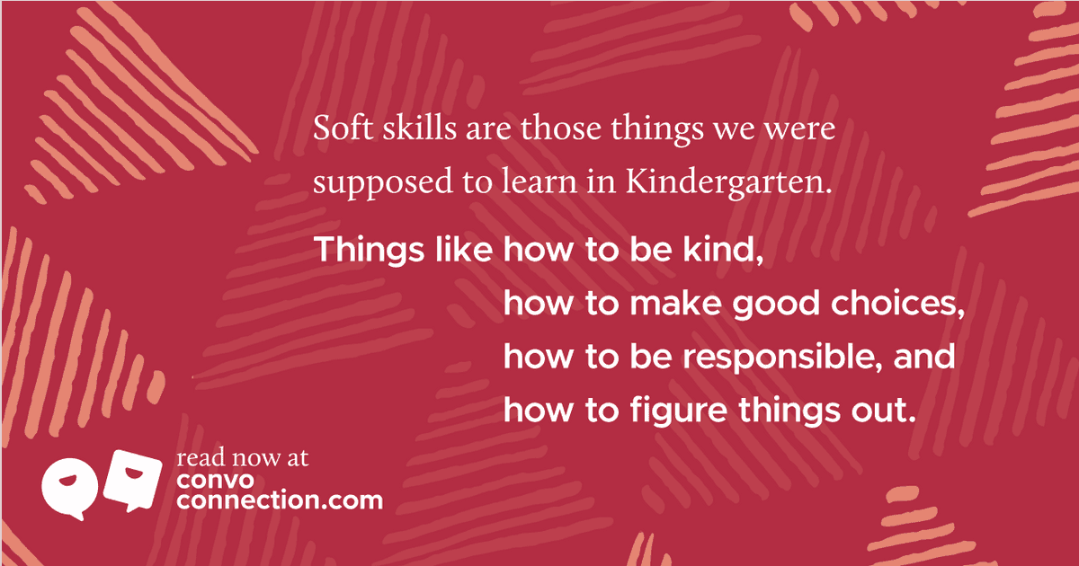
Social media helped to bring Convo Connection to an audience actively seeking to connect. We delivered quick inspirations and announced new articles, keeping the brand design consistent.
Platforms
YouTube, Facebook, Instagram, Pinterest
